Triptych Final project

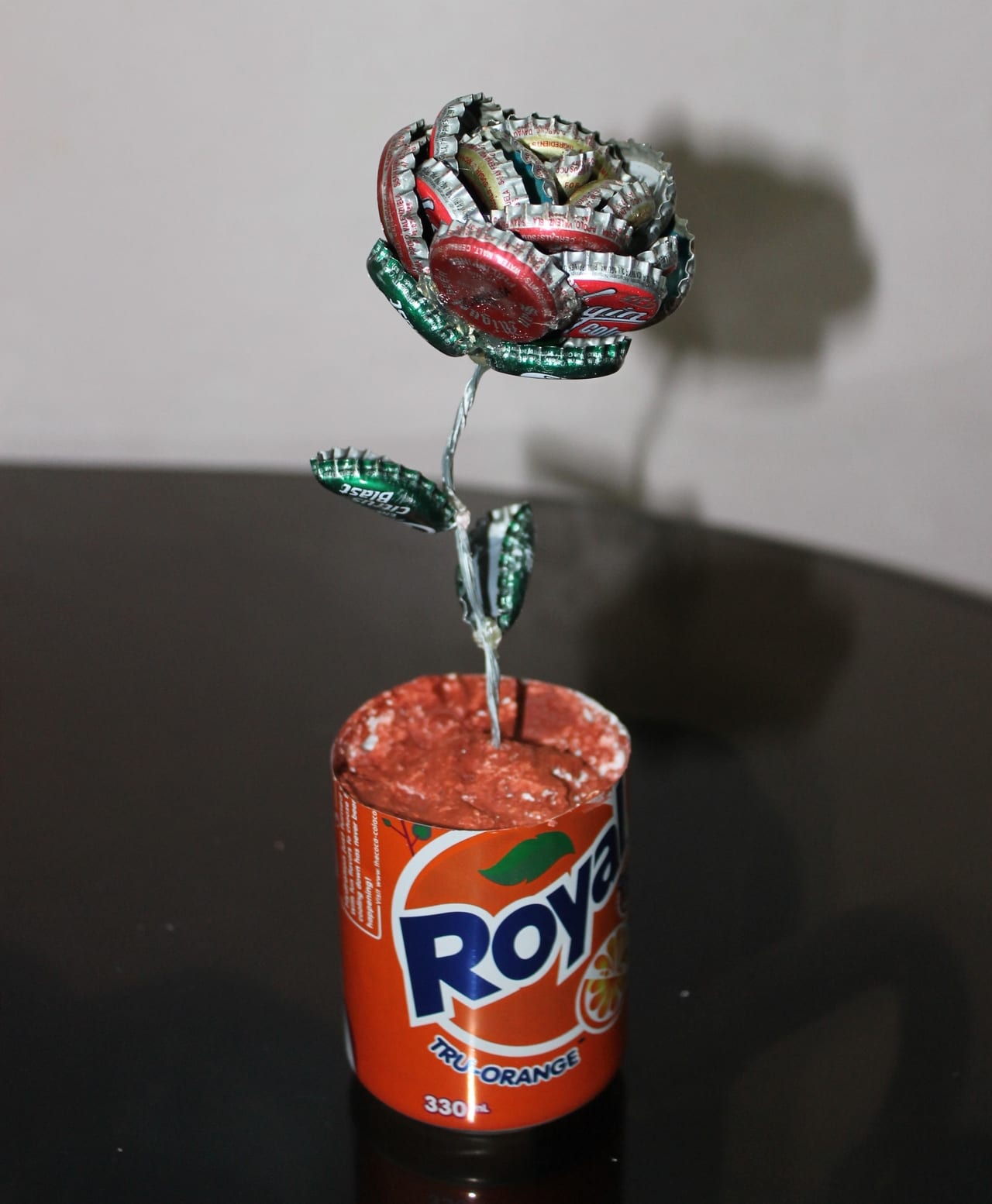
After the last idea didn’t turn out the way i had imagined i went back to the drawing board. With just coming off from valentines day i had the idea that i wanted to do something that tied in with the valentines day theme. I thought the perfect object to use would be roses since they are iconic with valentines and are usually relate-able to it. I first looked at some other works of triptych that involved roses. There was a lot of visual inspiration i could use for roses, like the examples below.

Triptych with Rose-1 Iborissova (2015) Pink flower. available from http://www.xrest.ru/original/Triptych%20with%20Rose-140139/

The pink rose was created by a user called Iborissova and can be found on xrest.com, I liked the way it showed the stages of the rose opening, from closed bud to its blossoming form. I think the image gives the viewer a sense of happiness and kindness, a light hearted feel, i wanted to be able to convey an emotion like this through the use of colour also. I also liked the way it was laid out the rose was center and lit properly.


there-were-roses-triptych-barbara-griffin Griffin, B. (2011-16) There were roses Triptych. available from http://fineartamerica.com/featured/there-were-roses-triptych-barbara-griffin.html


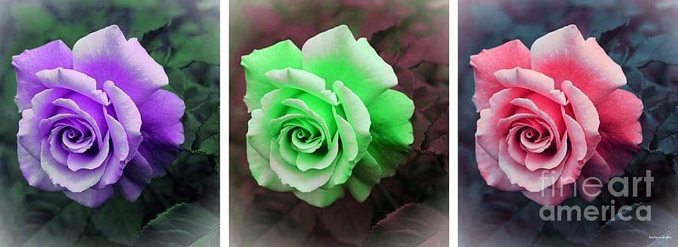
Another photographer I looked at was Barbara Griffin, who did this wonderful triptych rose artwork. I like the way the mix of colours gives a different emotion  for each image, and the colours clash and contrast with each other to make a eye catching piece of art.

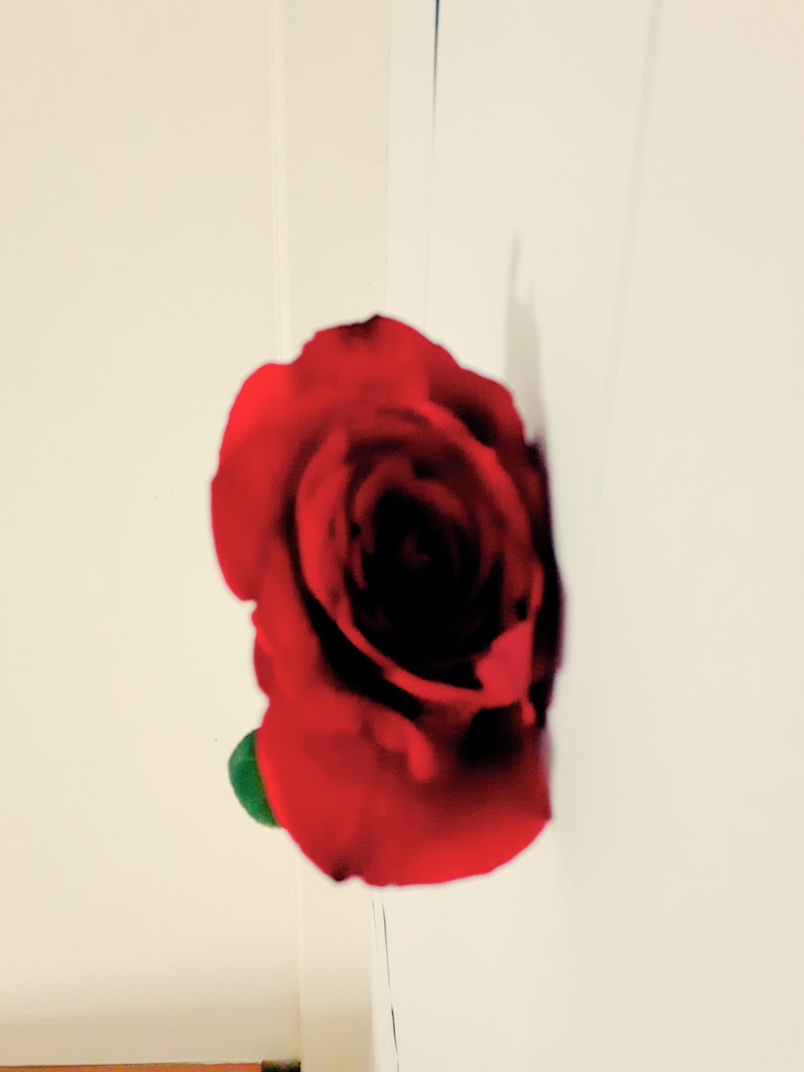
With a clear idea of what i wanted to do i started work on my new project, this time with more consideration for lighting and placement of camera and such for the best quality possible, i played around with some of the photos below, these are just a few of the pictures i had taken.

16-02-15-22-35-43-917_photo 16-02-15-22-39-27-937_photo 16-02-15-22-39-37-096_photo 16-02-15-22-43-48-270_photo 16-02-15-22-50-54-766_photo 16-02-15-22-51-03-374_photo 16-02-15-22-51-15-542_photo 16-02-15-22-52-34-481_photo 16-02-15-22-53-35-449_photo 16-02-15-22-53-45-061_photo 1455577459699 1455577589036

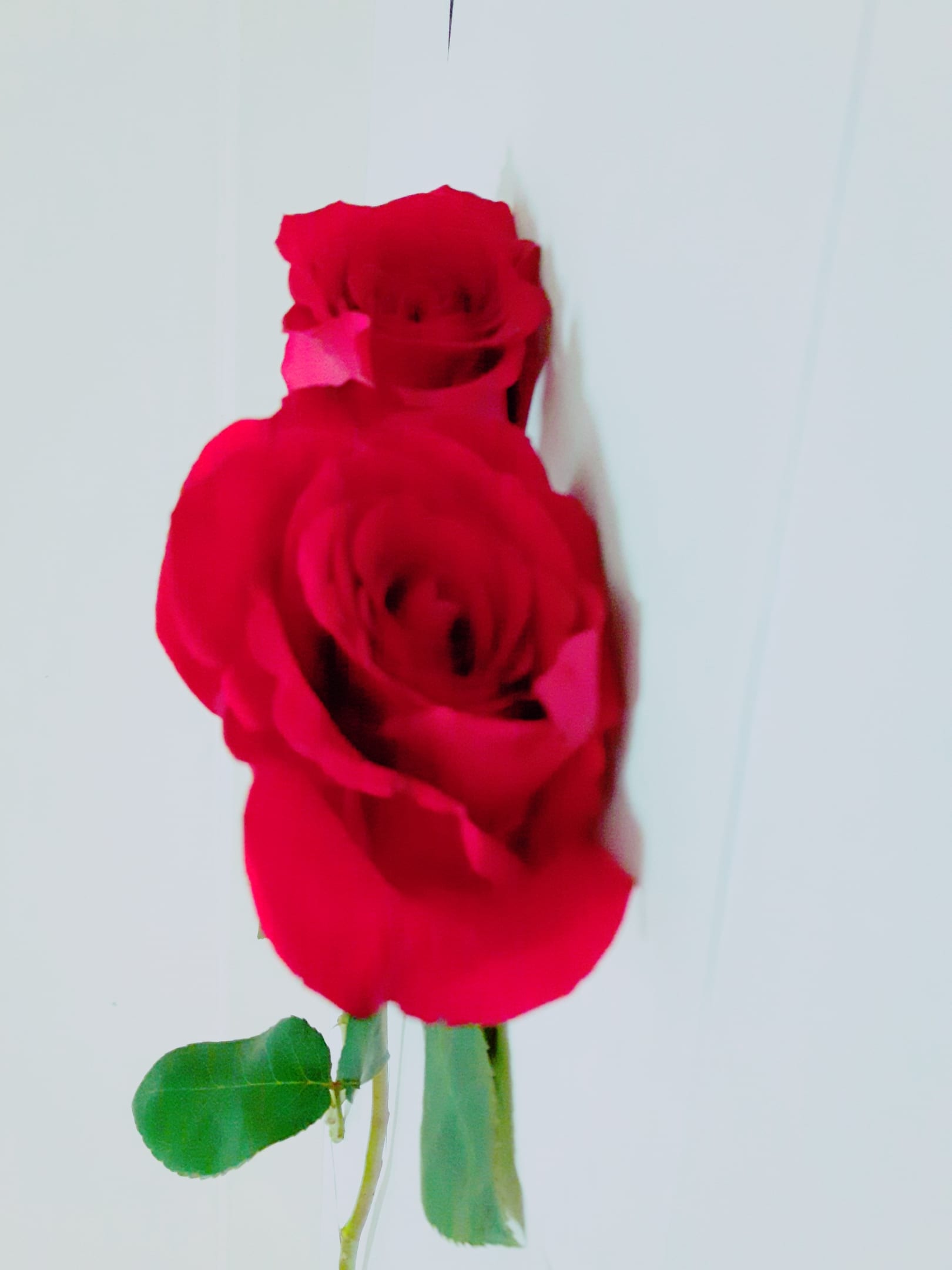
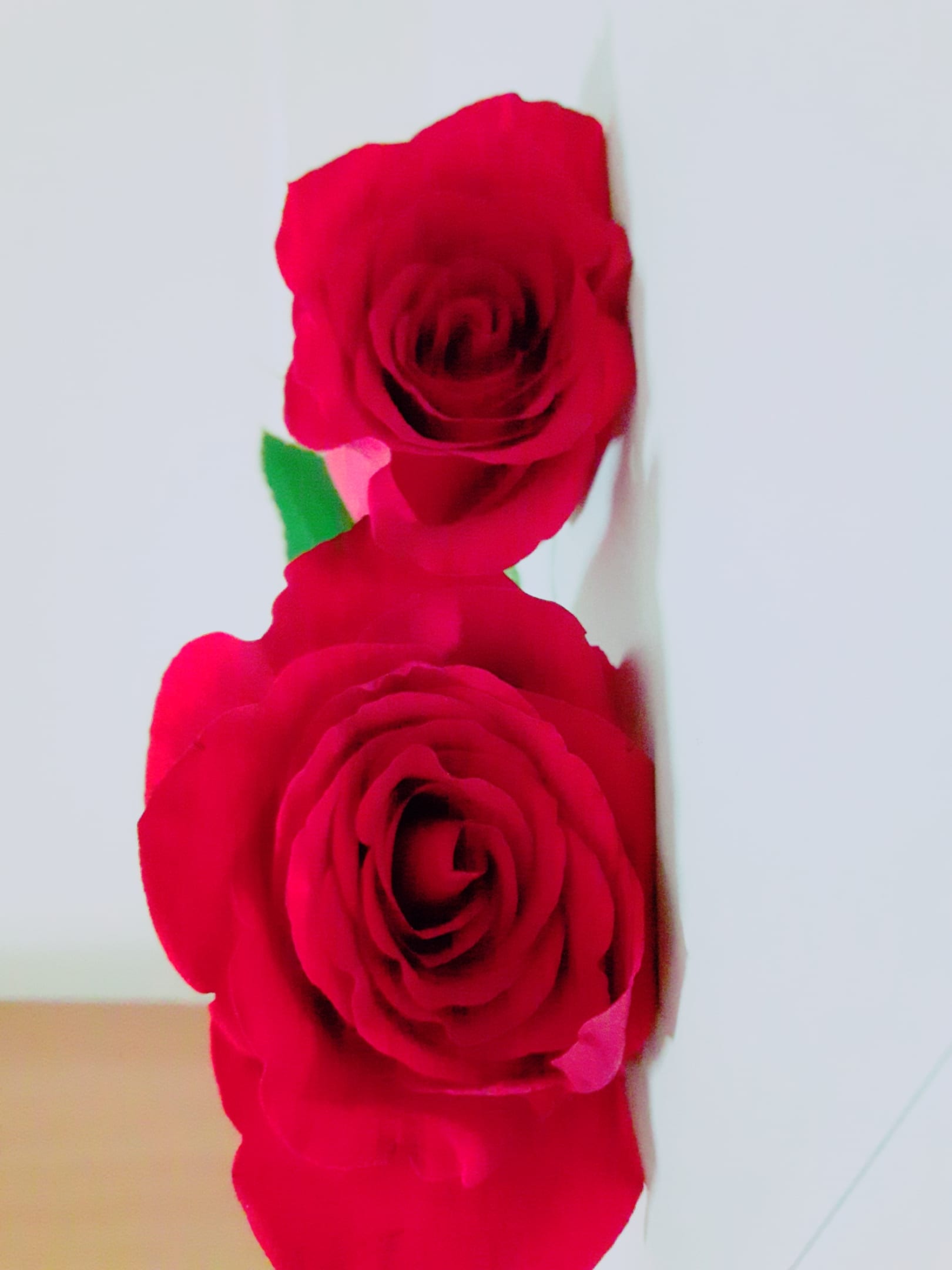
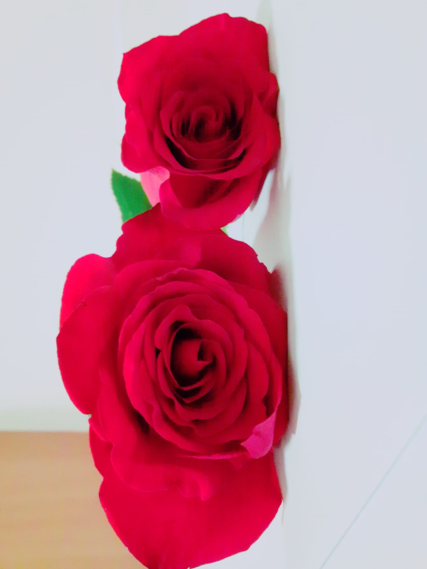
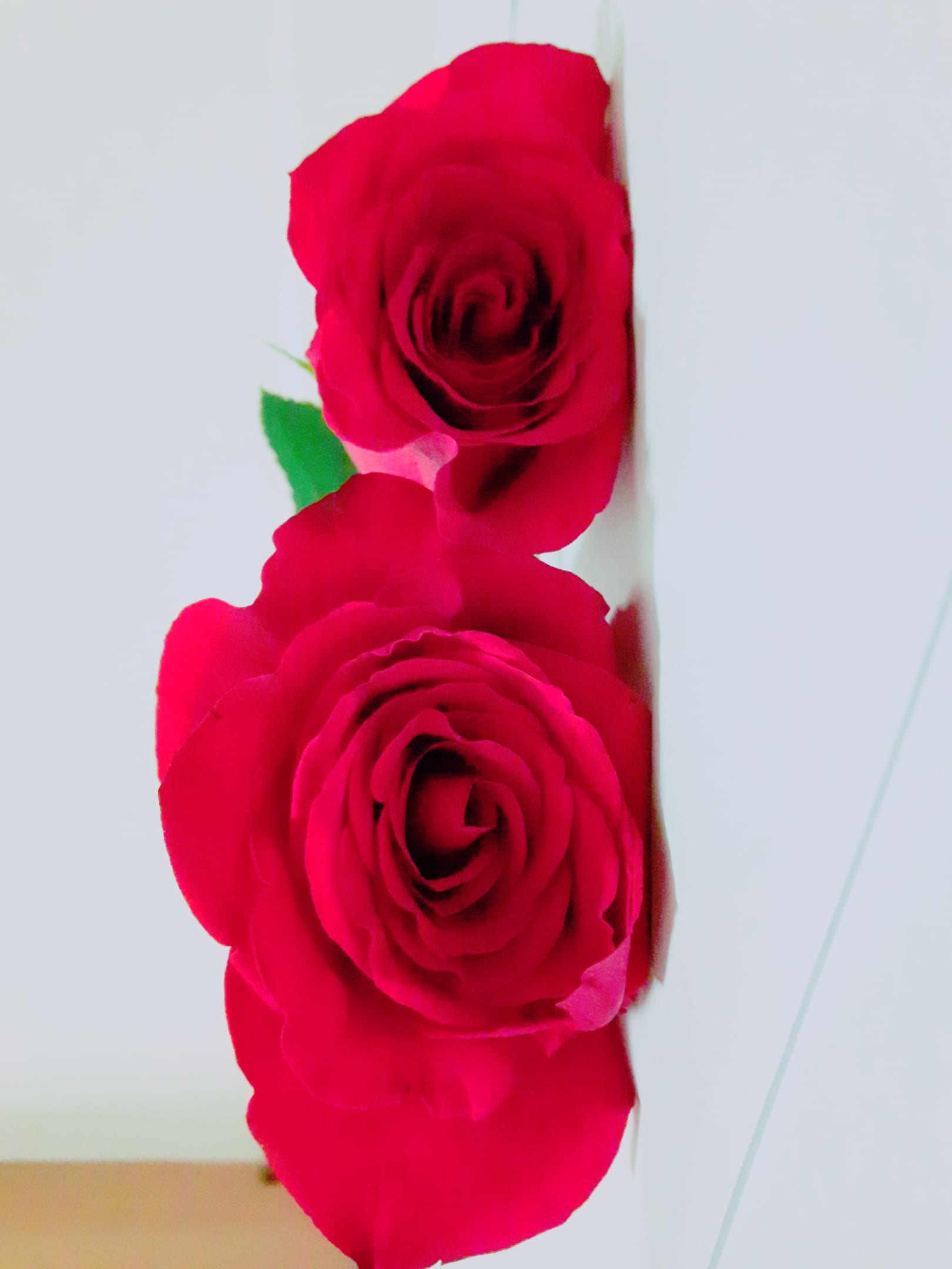
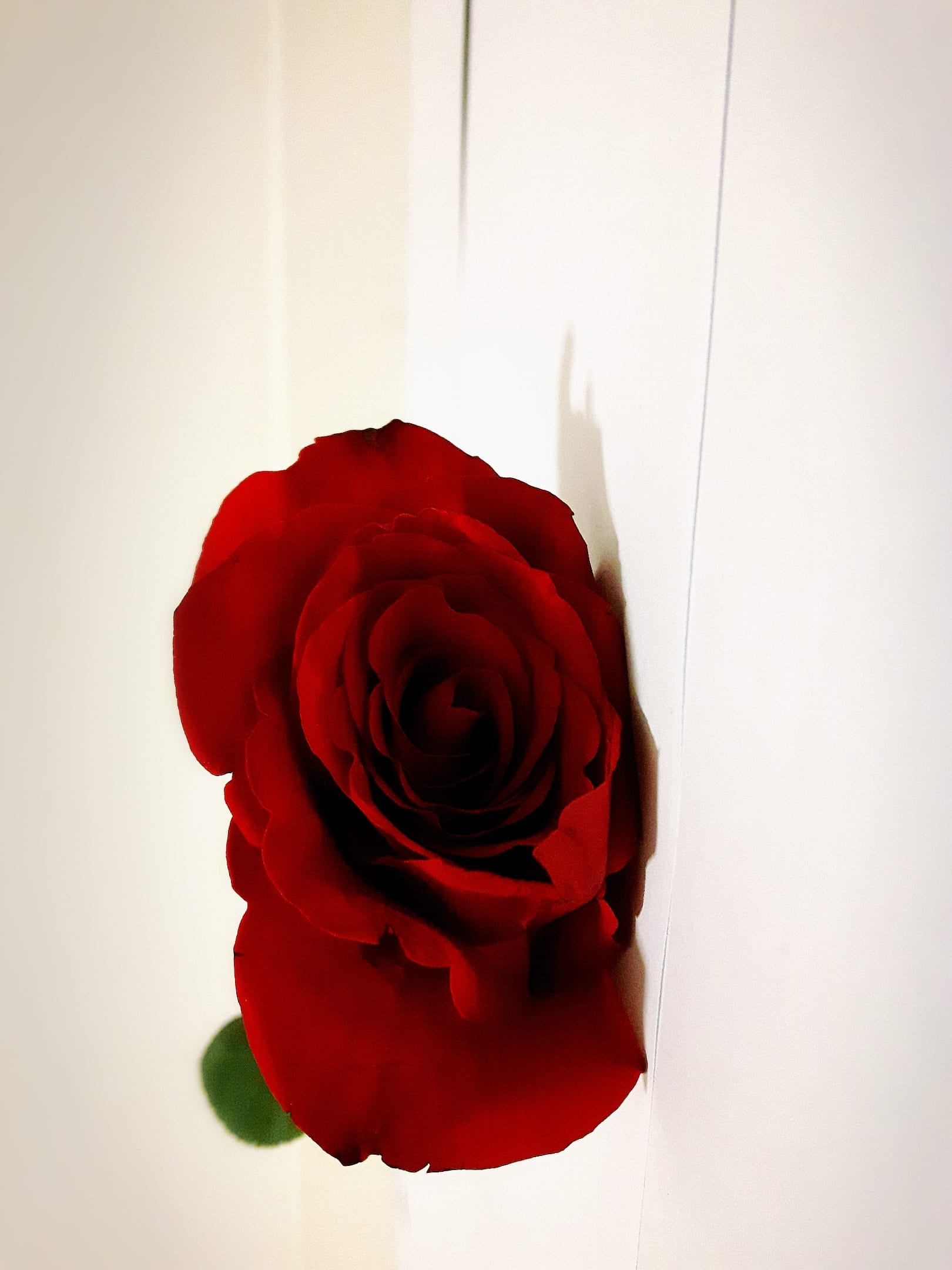
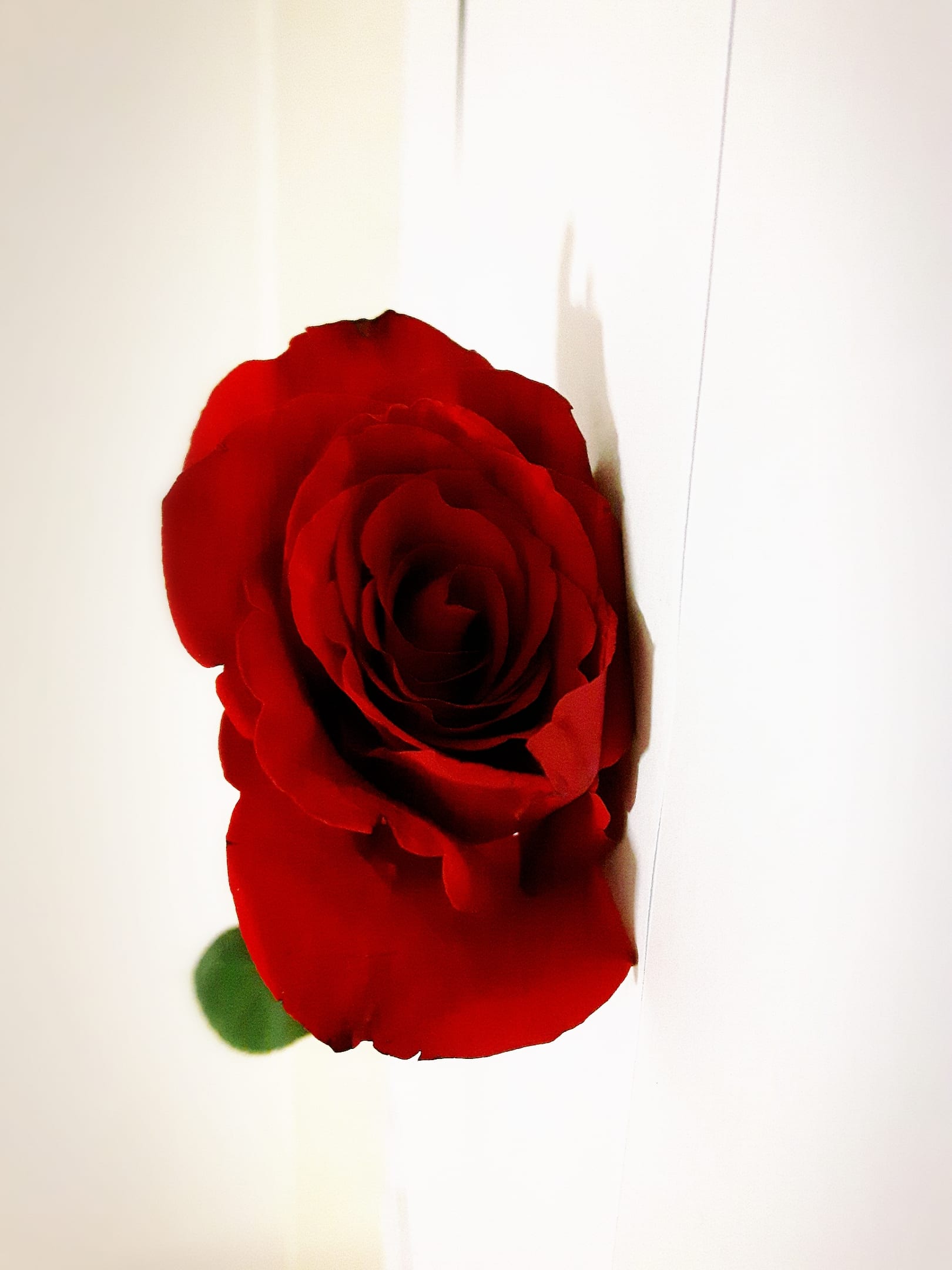
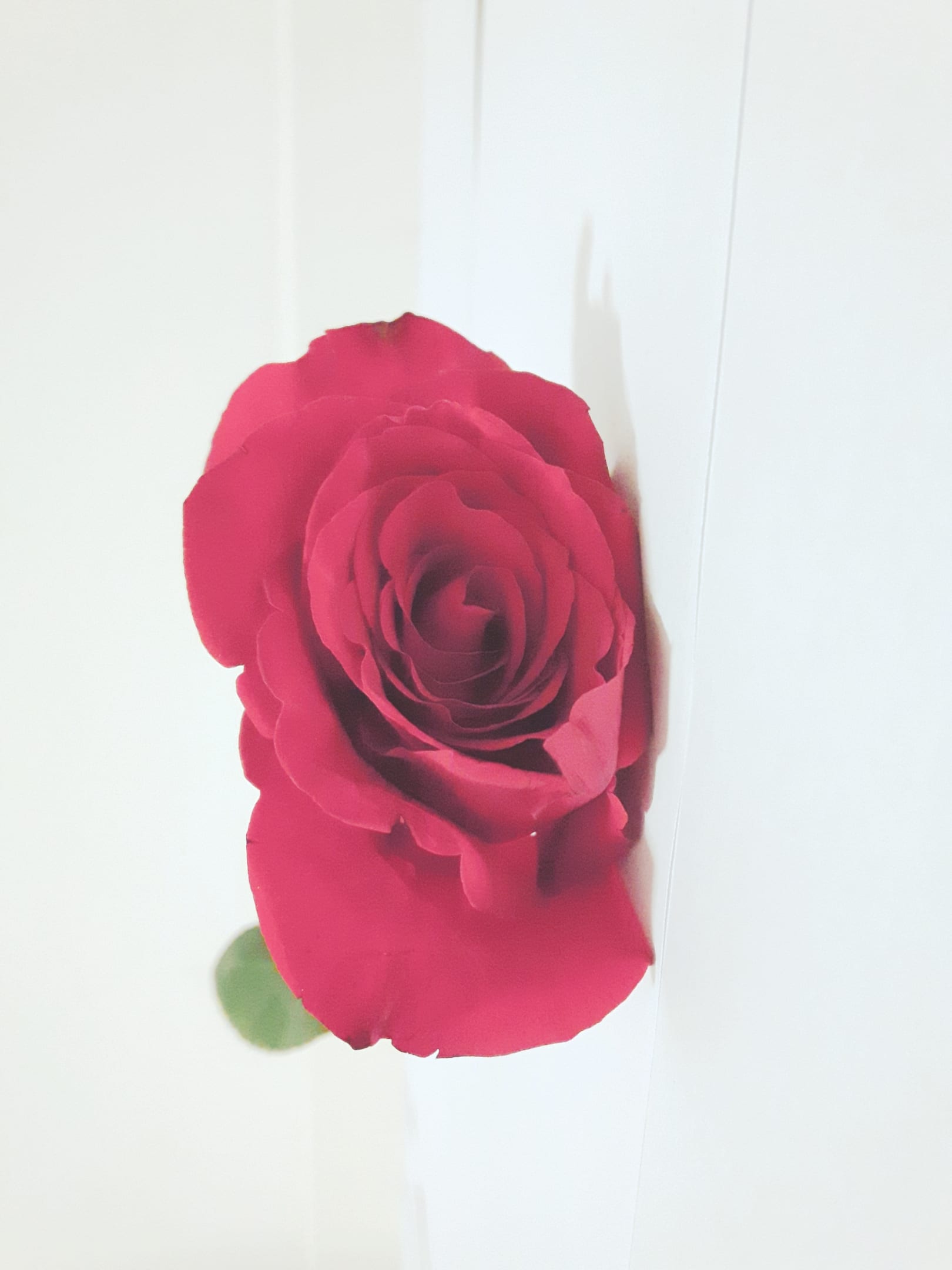
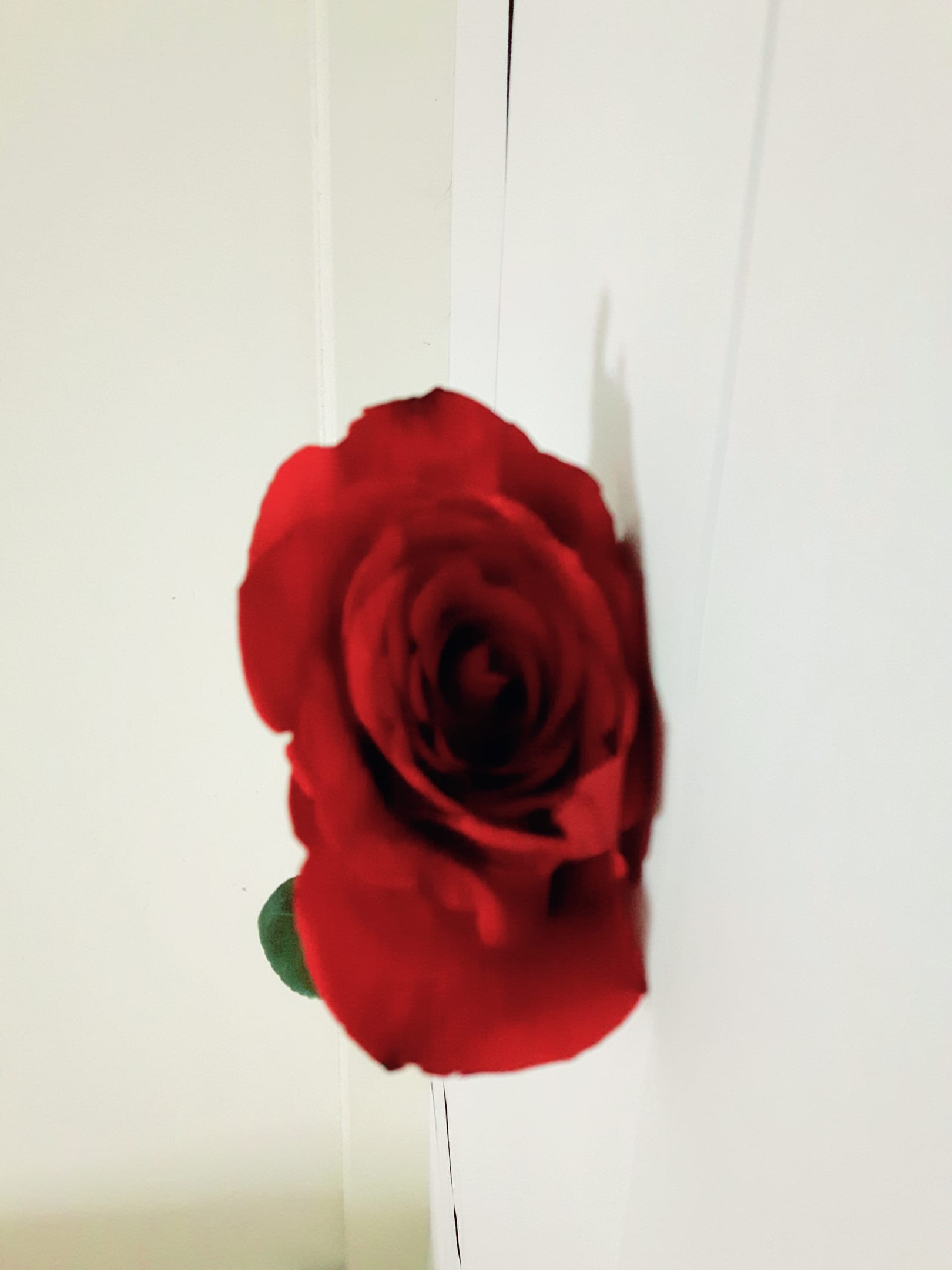
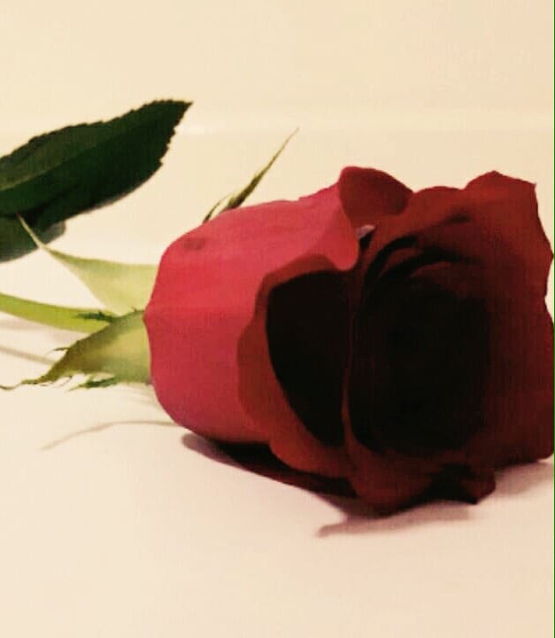
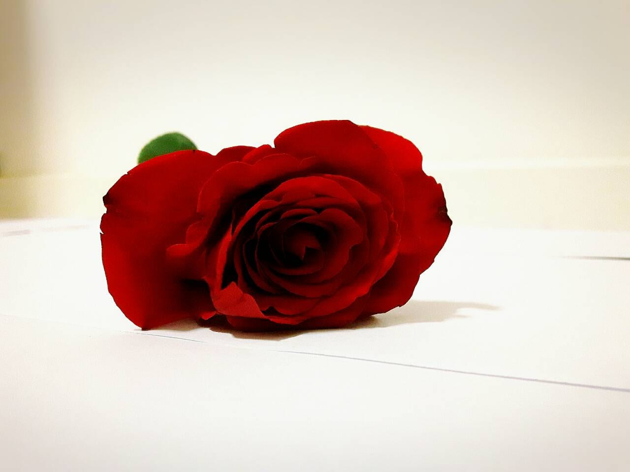
These were just a few of the pictures I had taken for my project, to be used in the triptych I had applied certain filters to see what kind of effect I could get get with each shot. I think the final results were far better and far more creative, then my old project that I had planned to do. Below is my finished triptych project.

Triptych 1


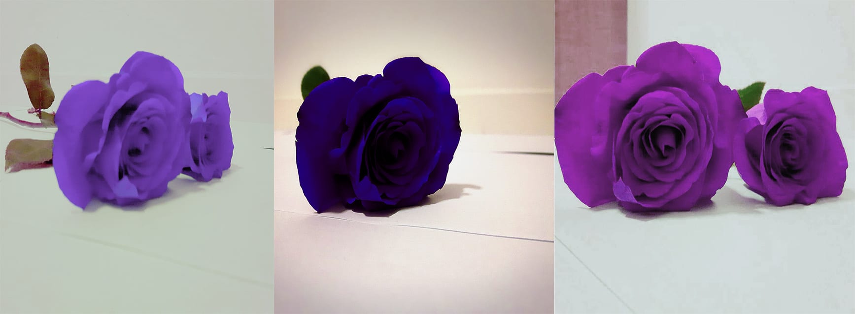
This is the final design for my triptych project, I had chosen the best quality images and edited them in photoshop. I love how this has turned out the contrast of colours work well with each other and it feels vibrant and lively inviting to me. the lighting complements the dark tone of the petals I believe and really makes it vibrant. there’s an array of different angled shots that I believe are quiet well done for my low budget environment, although i think the environment might be over exposed slightly.

763720bc5023d02bf78f613e307e4ba8

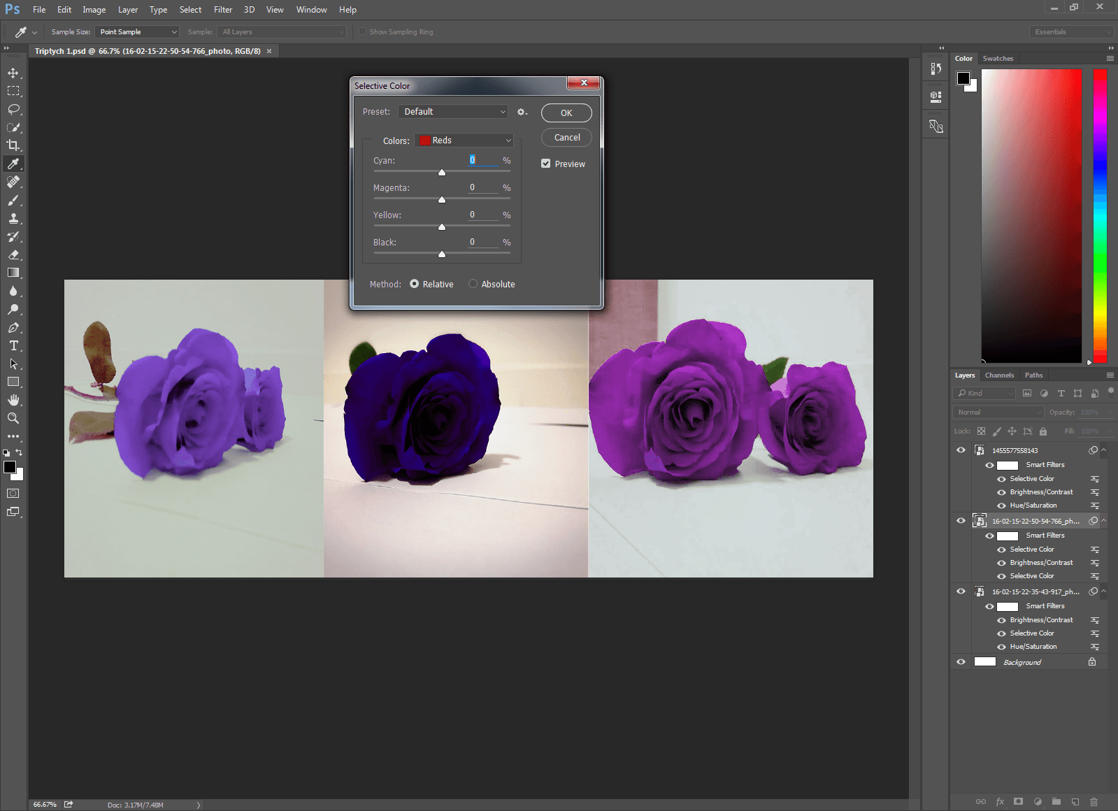
In photoshop I had used various tools like selective colour, hue and saturation, brightness and contrast. all these tools helped me to create the image above, by altering the colour of the petals, dimming the back ground, exposing and under exposing the image. I’ve used some of the basic photoshop skills and have applied it to the key areas of this project and it has worked magnificently.


Triptych idea 1

During one of the lectures, i had remembered seeing a photo with this wonderful piece of art made from gears and other various parts, and i had decided i wanted to make something similar to it, i had researched junk like art on the internet looking at various ways in which to make something new out of scrap or recycled material the image below is an example of the art i was looking at.

tumblr_mdvwr1KLqu1r5mmhlo1_1280


I wanted to try something similar with my triptych project. these pieces are much more intricate in design but it inspired me to at least try something similar. I had the idea to try and make town out of recycled material, i wanted it to show the stage and evolution of a town as it expands of time in the triptych format. This was much harder then i originally thought and didn’t work out exactly how i had planned. ( Junk flower original owner http://tumblropenarts.tumblr.com/post/36883063789/junk-art)

1455583978031 1455584999983 1455585007761

This was the project i had been preparing, the Pepsi  was supposed to represent a river separating the two side and the cans representing houses, in the later pictures i add a few more boxes and to show growth in the recycled town as it expanded. the final picture was the joining of the town via the bridge. I had used receipts as a bridge and the pringles cans to symbolize the bridge. I soon realized that no matter how much i looked at it it just looked like junk, there was now real creativity to it no life or spark, it felt rushed and was rather ugly to look at, I didn’t bother to edit the images because no matter how i changed the colour or contrast it just didn’t look how i imagined it. I had the idea that i wanted to do but i just couldn’t visualize it with the materials i had, so i had no choice but to think of a new idea something that had a more creative spark to it.

Wolf among sheep appropriation attempt 3

hiStock_000004801857Large


With my third attempt i stuck with the corporate business idea but instead talking creating it around the gaming industry i transformed this picture into what i think being in the bushiness industry is like. again there wasn’t really anyone who inspired me to create the photos as i did its just what felt natural or what came to my mind at the time. the edited version is below.

wolf among sheep

This is the edited photo of the picture. to me i feel when working in a business or a industry, there’s always the wolf, the boss for example, and the sheep are the people who work under them, who basically follow any order they follow without question, to advance in there career. the picture also symbolizes the quote a wolf among sheep, i think that’s kind of where i got the idea for this picture form.

Corporate stock / karate movie Appropriation attempt 2

I was scrolling through Googles businessman stock photography search. and i discovered this picture:

2944218-businessman-jump

To me this just seemed like some crazy karate movie involving corporate business men. initial i tried to find a Jet lee cover that i could maybe stick him to but it just didn’t seem to work well and there really wasn’t much context behind it to justify appropriation. Eventually i came across another photo that was just perfect for what i had in mind. the picture below is its unedited form.

flying_kick_by_timrecede

I had the idea that i could remove the flying kicking man and replace him with the business man i had found previously, and instead of having like the businessman being mugged for his money, i thought in today’s world big time corporation especially in the gaming industry tend to be very penny squeezing  when it comes to their content that you can purchase for ludicrous amounts of money, i thought how about the we have the business man beating you up for your money. The outcome is what follows below.

Corperate karate


I think this picture is superior to my first attempt at appropriation as it takes that cinematic photo and as i see it turns it into a picture that has a different context and meaning behind it. how companies nowa days to to want to milk its consumer base for all its worth, with some what little regard to its consumers, again this is coming from the gaming industry stand point. its a topic i rather hold dear to my heart so this felt a little more natural to me and it felt like it fit well i bit more.


Swan poster Edit appropriation attempt 1

Edited picture of the poster in the swan.

So this is the edited photo of the poster I found in the swan. This might seem like complete nonsense but its actually based a rather popular internet meme a while back about barfing rainbows when your feeling happy. maybe not as serious as it could have turned out, if more had maybe put some more effort and thought into it, but it was very much a spur of the moment and just experimenting with the picture. In the next few pictures, there is a more coherent thought process behind them. (images of the internet meme http://www.bing.com/images/search?q=puking+rainbows+meme&view=detailv2&&id=CEC29EF3636484AB911572E4C54E05C9B202C980&selectedIndex=4&ccid=hASiZl9D&simid=608043653459150833&thid=OIP.M8404a2665f43a1a3d049e9e1448a8565H0&ajaxhist=0)

Picture of one of the posters in Swan.

This is the original image of the poster unedited. i found this poster hung up on the wall in the swan, it just caught my eye at how somber it was, rather sad looking in a way, at least is what emotion i was getting from it, and immediately a few ideas hit me of how i can maybe change this photo.. more of a comedic way. but i really didnt know what this poster was trying to advertise, especially in a social area, it just seemed rather odd and depressing.